


31 Jul A Quick Start Guide to Landing Page Design
A Quick Start Guide to Landing Page Design
What Is Landing Page Design (And Why It Decides Your Conversions)
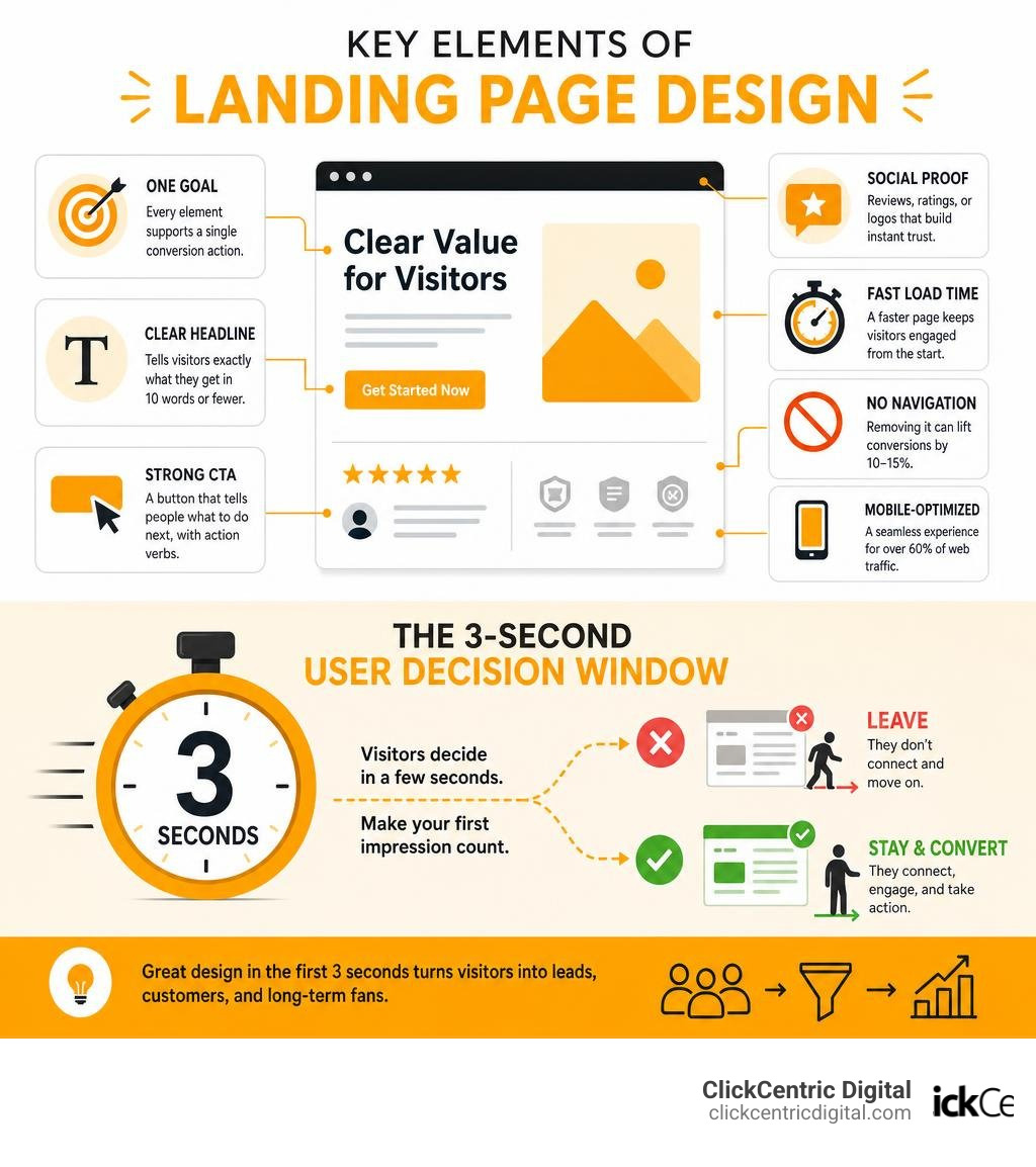
Landing page design is the practice of building a single, focused web page built to turn visitors into leads, customers, or sign-ups — with zero distractions pulling them away.
If you’re looking for a quick answer, here’s what makes a landing page work:
- One goal — every element on the page serves a single conversion action
- Clear headline — tells visitors exactly what they get in 10 words or fewer
- Strong CTA — a button that tells people what to do next, with active verbs
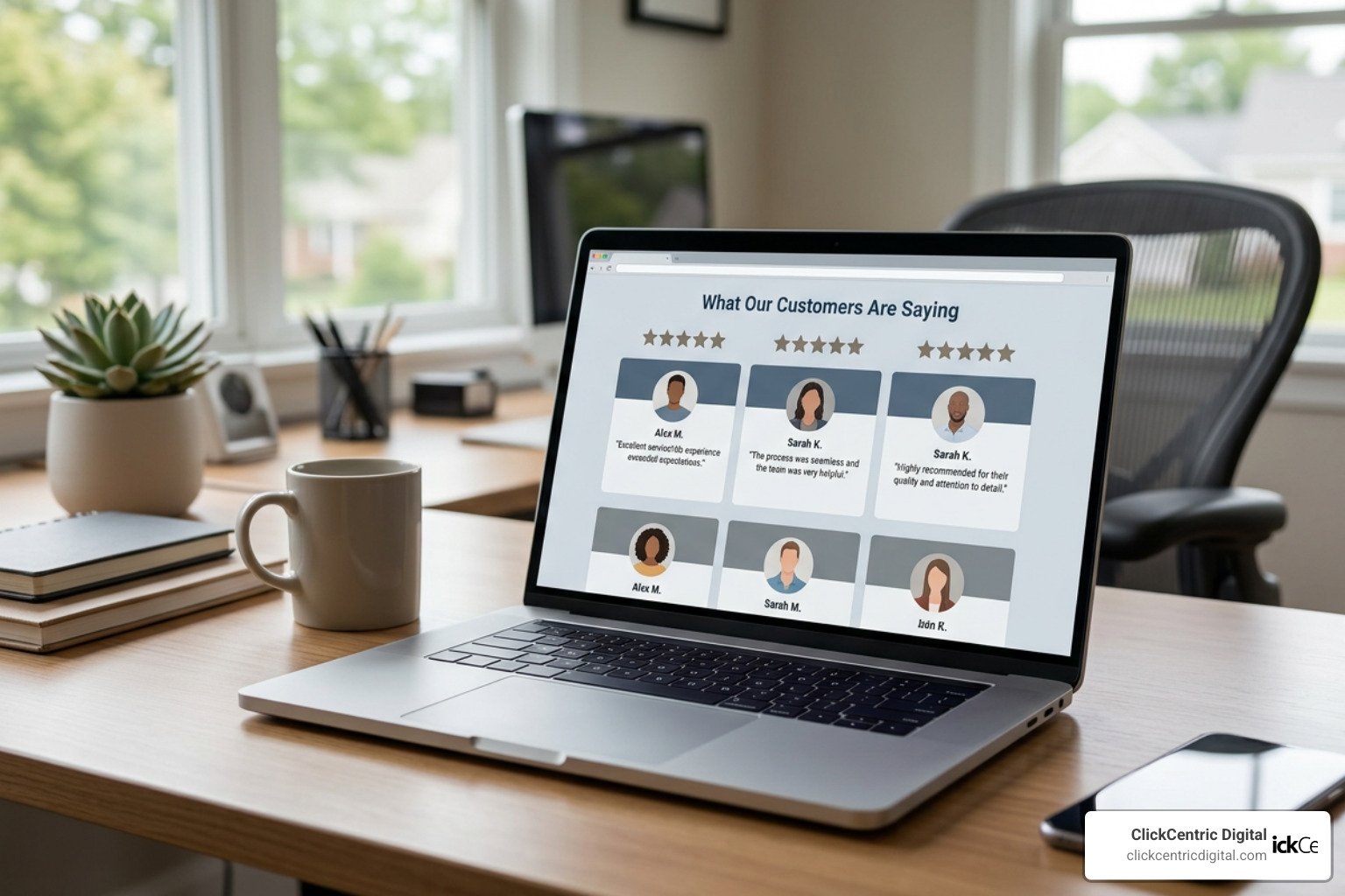
- Social proof — reviews, ratings, or logos that build instant trust
- Fast load time — a page that loads in 1 second converts 3x better than one that takes 5 seconds
- No navigation menu — removing it can lift conversions by 10–15%
- Mobile-optimized layout — over 60% of web traffic comes from phones
Here’s the uncomfortable truth for most local business owners: you have about three seconds to convince a visitor to stay.
Research shows that modern consumers decide whether to engage with a business or keep scrolling in just a few seconds. That first impression isn’t shaped by your pricing or your years of experience — it’s shaped entirely by how your page looks and feels the moment it loads.
The average website converts just 2.35% of visitors. The top 10% of pages? They convert at 11.45% or higher. That gap comes almost entirely from design decisions — not from traffic quality or even the strength of the offer.
For a local business trying to make every ad dollar count, that gap is the difference between a campaign that pays for itself and one that quietly drains your budget.
Landing Page vs. Website: Understanding the Core Differences
A common mistake we see businesses make in West Michigan is sending paid traffic or local search clicks directly to their homepage. To understand why this hurts your bottom line, consider the difference between a multi-page website and a dedicated landing page.
A standard website homepage is like a sprawling restaurant menu. It has to serve everyone: existing clients, job seekers, investors, and casual browsers. It features a navigation header, social media links, a blog feed, and perhaps a history of the company. It is designed for exploration.
A landing page, on the other hand, is like a specialized local sandwich shop that only sells one award-winning sub. It has one job: to present a single, compelling argument and guide the visitor toward one specific action.
To achieve this singular focus, we must eliminate all exit routes. Removing the standard navigation menu from a landing page is the single highest-impact, lowest-effort conversion improvement you can make. When you give users fewer places to wander, you keep them focused on the primary conversion path.
This hyper-focused approach aligns perfectly with modern conversion frameworks. If you are curious about how ongoing, performance-based updates can continuously improve your digital footprint, learn How Growth Driven Web Design Saves You from Redesign Hell.
When landing pages fail to convert, it is usually because they fall victim to common design traps. Here is a list of the most frequent landing page usability errors:
- Lengthy, intimidating forms that ask for too much personal information upfront
- Small, hard-to-click buttons that frustrate mobile users
- Overwhelming walls of text instead of clean, scannable layouts
- Complicated or distracting navigation that allows users to wander away from the offer
- Slow page load times that cause users to abandon the page before it even renders
- Lack of clear visual hierarchy, leaving visitors confused about what to do next
- Generic stock photography that actively reduces trust
Essential Components of High-Converting Landing Page Design
Every high-converting landing page is built on a structured framework. Think of it as a logical, psychological sequence that takes a cold visitor and turns them into a confident customer.
The essential components include a compelling hero section, a clear value proposition, verifiable social proof, a prominent call to action (CTA), and a frictionless form. We structure these elements to guide the user’s eyes naturally down the page, systematically addressing their unspoken objections along the way.
For inspiration on how beautiful aesthetics and conversion-focused layouts come together, you can browse over 7,300 curated examples on Landing Page Design Examples: 7,300+ Best Landing Pages | Lapa … .
Crafting the Hero Section in Landing Page Design
The hero section is the first thing a visitor sees “above the fold” before they scroll. It has one primary job: to earn the scroll. If your hero section is confusing or slow, the visitor will bounce.
To design a high-performing hero section, you need four key elements:
- The Headline Hook: This should be a benefit-driven statement of 10 words or fewer. Instead of a generic greeting like “Welcome to Our Professional Services,” use a specific, outcome-oriented headline such as “Get a Beautiful, Client-Generating Website in 6 Weeks.”
- The Subheadline Context: This is a short paragraph of 15 to 25 words that expands on the headline, qualifies the offer, and explains exactly how you deliver on your promise.
- The Visual Asset: The human brain processes images approximately 60,000 times faster than written words. Use a high-quality, real photo of your product, your team, or the ultimate result of your service. Avoid generic stock photos, which modern consumers easily spot and ignore.
- The Primary CTA: Your main button should be highly visible, using a high-contrast color that stands out from the rest of the page design.

Reducing Friction in Landing Page Design Forms
Your form is the gateway to your conversion. Every extra field you add to a form measurably reduces completion rates. In fact, reducing form fields from 11 down to 4 can increase conversions by up to 120%.
To reduce friction on your landing page forms:
- Ask for the absolute minimum: If you only need an email address to send a guide, only ask for the email.
- Label fields clearly: Place labels above the input fields rather than inside them as placeholder text, so users don’t lose context when they start typing.
- Use inline validation: Show green checkmarks or helpful error messages in real-time as the user types, rather than making them hit “Submit” only to find out they made a mistake.
- Optimize for mobile inputs: Ensure that email fields trigger the email keyboard (with the “@” symbol) and phone fields trigger the numeric keypad on mobile devices.
Technical Best Practices: Speed, Mobile, and Optimization
A beautiful landing page is useless if nobody waits for it to load. In 2026, technical optimization is not just a developer’s job — it is a core design decision.
A page that loads in 1 second converts at three times the rate of a page that takes 5 seconds. Furthermore, as load times stretch from 1 to 3 seconds, your bounce rate increases by 32%. If it takes 6 seconds, the bounce rate leaps by 106%.
Beyond speed, your design must be universally usable. Designing with accessibility in mind ensures that your page is clear and easy to navigate for everyone, including those using screen readers or keyboard navigation. For a deep dive into these standards, read our guide on Inclusive Web Design Best Practices for a Website Everyone Can Use.
Optimizing Page Speed and Core Web Vitals
To keep page speed high and prevent visitors from bouncing, we recommend implementing these five critical technical fixes:
- Convert Images to WebP: Traditional JPEG and PNG files are too heavy. Converting your visual assets to WebP can reduce image file sizes by 25% to 35% without losing quality.
- Implement Lazy Loading: Instruct the browser to load only the images and videos that are visible in the viewport. Below-the-fold content should only load as the user scrolls down.
- Defer Non-Critical JavaScript: Make sure your essential page styling and above-the-fold elements load first. Non-essential scripts, like tracking pixels or chat widgets, should load after the page has painted.
- Use a Content Delivery Network (CDN): Host your landing page assets on a global network of servers so that your page loads instantly, whether a user is browsing from Grand Rapids or Kalamazoo.
- Prevent Cumulative Layout Shift (CLS): Set explicit width and height attributes on all images and media elements. This prevents elements from jumping around as the page loads, which is highly frustrating for users.
Designing for Mobile Responsiveness
With over 60% of global web traffic coming from mobile devices, you should design your mobile layout first and then expand outward to desktop screens. On a phone, your multi-column desktop layout must stack into a clean, single-column flow.
Keep your primary CTA button easily accessible by using a sticky footer CTA that remains visible at the bottom of the screen as the user scrolls. Additionally, make sure all buttons and form fields have a minimum tap target size of 48px by 48px to prevent accidental clicks.
| Design Element | Desktop Priority | Mobile Priority |
|---|---|---|
| Layout Structure | Multi-column grid with generous horizontal whitespace | Single-column vertical stack with clear scrolling flow |
| CTA Placement | Fixed in the hero section and repeated in key sections | Sticky CTA anchored at the bottom of the viewport |
| Typography | Larger, expressive headlines with balanced subheaders | Highly readable body font sizes (minimum 16px) |
| Visual Elements | Large, high-resolution product showcases and hover states | Light, compressed images with zero hover dependencies |
| Interactive Elements | Multi-step hover menus and interactive visual grids | Large tap targets (minimum 48x48px) and native inputs |
Running Systematic A/B Tests and Personalization
The best landing page designs are never truly finished; they are continuously tested and refined. A/B testing allows you to split your traffic between two versions of a page to see which one performs better.
When testing, only change one variable at a time — such as the headline, the color of the CTA button, or the hero image — so you can isolate exactly what caused the shift in conversions.
To take your performance to the next level, personalize your landing pages. Using personalized landing pages tailored to specific referral traffic sources, search queries, or geographical locations can boost your conversion rates by up to 34%.
For example, if you are running Google Ads in West Michigan, you can map specific ad groups directly to matching landing pages. If a user searches for “Web Design in Holland MI,” they should land on a page that immediately highlights your local services in Holland, matching their search intent perfectly.
Frequently Asked Questions about Landing Page Design
What is a good conversion rate for a landing page?
While the average website converts at around 2.35%, a good conversion rate for a dedicated landing page is around 10%. The top 10% of landing pages achieve conversion rates of 11.45% or higher. Generally, lead generation pages (where users exchange their contact info for a free quote or guide) convert at higher rates than e-commerce checkout pages.
Should a landing page have a navigation menu?
No. A landing page should not have a standard navigation menu. Removing the header navigation eliminates distractions and exit routes, keeping the user focused entirely on your primary offer. Studies show that removing navigation menus consistently improves landing page conversion rates by 10% to 15%.
How long should a landing page be?
The length of your landing page should match the complexity and commitment level of your offer. If you are asking for a simple email address in exchange for a free checklist, keep the page short (just a hero section, a few bullet points, and the form). If you are selling a high-priced local service, you will need a longer page that includes detailed benefit breakdowns, an explanation of how the process works, extensive social proof, and an FAQ section to address common objections.
Conclusion: Let’s Build Your High-Converting Page
A great landing page is not just a beautiful design; it is a carefully structured, highly optimized conversion engine. From a lightning-fast hero section to frictionless forms and localized social proof, every single element on the page must work together to turn casual visitors into loyal customers.
If you are ready to stop losing valuable traffic and want to maximize your return on ad spend, we can help. At ClickCentric Digital, we specialize in helping businesses across West Michigan — including Grand Rapids, Holland, Grand Haven, South Haven, and Kalamazoo — design high-converting landing pages, improve local search rankings, and manage local review campaigns.
Let’s turn your clicks into customers. Explore our Website Design & Development Services today, and let’s build a landing page that actually grows your business.
Sorry, the comment form is closed at this time.