

21 Jul Don’t Judge an Ebook by Its Cover—Judge It by Its Landing Page Design
Don’t Judge an Ebook by Its Cover—Judge It by Its Landing Page Design
Why Your Ebook Landing Page Design Can Make or Break Your Conversions
Good ebook landing page design is the difference between a valuable resource gathering dust and a lead generation machine working around the clock.
Here’s a quick answer if you’re in a hurry:
The essential elements of a high-converting ebook landing page:
- Benefit-driven headline — sell the outcome, not the title
- 3D ebook cover mockup — builds perceived value instantly
- Short opt-in form — 3 fields or fewer (ideally just email)
- Scannable bullet points — show what readers will gain
- Single clear CTA — one button, one goal, no distractions
- Social proof — testimonials, download counts, or logos
- No navigation menu — remove all links that compete with the CTA
The numbers back this up. The average landing page converts at around 11%. Ebook landing pages? They average 24% — more than double. That’s not a coincidence. It comes down to focused design, a clear value exchange, and removing every possible distraction.
Think about it from your visitor’s perspective. They land on your page. They want one thing: to know if your ebook is worth their email address. Every extra link, menu item, or competing offer chips away at that decision.
A clean, focused page makes the choice easy. A cluttered one makes them leave.
Whether you’re a local business owner building your first lead magnet or a marketer trying to squeeze more out of existing traffic, understanding what makes an ebook landing page work is worth your time.
This guide walks you through every element — from layout and copy to forms, mobile design, and delivery — so you can build a page that actually converts.
What is an Ebook Landing Page and Why Does It Convert at 24%?
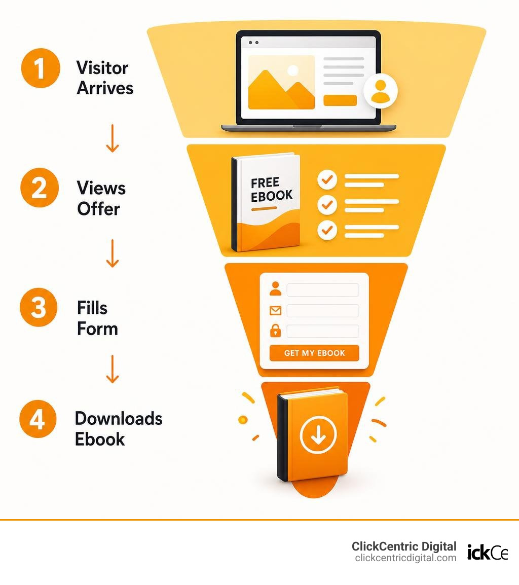
An ebook landing page is a standalone, single-purpose web page designed with one clear objective: to persuade visitors to download your ebook. Unlike standard website pages that encourage exploration, a landing page focuses entirely on a singular transaction—exchanging valuable written content for a visitor’s contact details or a direct purchase.
Ebook Landing Page vs. Standard Web Pages
The primary difference between a landing page and a standard website page lies in the layout and user intent. A typical homepage or blog post is filled with navigation menus, sidebars, internal links, and social sharing icons. These elements are great for brand awareness, but they act as “leaks” when your goal is conversion.
When we design an ebook landing page design, we systematically remove these distractions. By stripping out the main navigation, we provide what psychologists call cognitive ease. According to the Nielsen Norman Group’s research on cognitive ease, users prefer designs that make information processing simple and effortless. When a page has only one clear path forward, the user experiences less mental friction, making them far more likely to complete the sign-up form.
For inspiration on how this looks in practice, you can explore the eBook Landing Page Examples – Gallery – MailerLite or review How an Ebook Landing Page Works: 5 Effective Examples (2026) – Shopify. These resources demonstrate how top brands structure their pages to maintain a laser focus on the offer.
The Psychology Behind the 24% Conversion Rate Benchmark
Why do ebook landing pages achieve an impressive 24% conversion benchmark compared to the 11% industry average for other landing pages?
- High Search and Solution Intent: Visitors landing on these pages are usually in “research mode.” They are actively looking to solve a specific pain point.
- Low-Friction Value Exchange: For free ebooks, trading an email address for a high-value guide feels like a fair, low-risk bargain.
- Immediate Gratification: The promise of an instant download satisfies the user’s desire for immediate answers.
When you align a highly specific audience with a hyper-focused page, your conversion rates naturally skyrocket.
Anatomy of a High-Converting Ebook Landing Page Design
To build a page that consistently hits or exceeds that 24% conversion benchmark, you must arrange your visual and textual elements strategically. This visual hierarchy guides the user’s eye from the initial hook down to the final call-to-action.
Crafting the Perfect Ebook Cover Design and Visual Mockups
We’ve all heard the old advice not to judge a book by its cover. In digital marketing, however, visitors judge your ebook’s quality entirely by its visual presentation. A professional, high-resolution mockup signals that the content inside is valuable, polished, and worth their time.
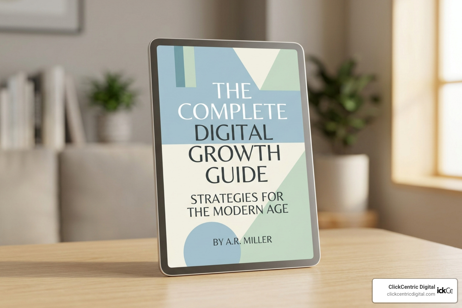
Instead of using a flat, 2D image of your cover, use a 3D mockup that displays the ebook on a tablet, e-reader, or as a physical book. This makes the digital asset feel tangible. You can browse Dribbble’s showcase of creative ebook cover designs to find visual inspiration, or use customizable templates to quickly build professional layouts.
Communicating Value with Benefit-Driven Copy and Headlines
Your headline has one job: hook the visitor within three seconds. Instead of simply writing the title of your ebook at the top of the page, lead with a benefit-driven headline that sells the ultimate outcome.
- Weak Headline: “Download Our Guide to Local SEO”
- Strong Headline: “Double Your Website Traffic: The Step-by-Step Local SEO Playbook”
Once your headline grabs their attention, use scannable, outcome-focused bullet points to explain what is inside. Address your reader’s pain points directly. Instead of listing chapter names (e.g., “Chapter 1: Keyword Research”), describe the practical value they will receive (e.g., “Learn how to find the exact search terms your local customers are using right now”). For a deeper dive into structuring these conversion-tested layouts, check out How to Create an eBook Landing Page That Converts.
Optimizing Lead Capture: Forms, CTAs, and Social Proof
Once your visuals and copy have built desire, you need to make the actual opt-in process as seamless as possible. Any friction at this stage will cause potential leads to abandon the page.
Form Design and Friction Reduction Best Practices
The golden rule of form design is simple: ask only for what you absolutely need. For a free ebook, an email address (and perhaps a first name for personalization) is usually sufficient.
Every extra field you add to your form reduces your conversion rate. In fact, cutting a form from four fields down to three can lift submissions by roughly 50%. If you are running a B2B campaign where lead quality is more important than sheer volume, you might include fields like “Job Title” or “Company Size,” but be aware of the trade-off in conversion rates.
For advanced form styling and layout guidelines, read Smashing Magazine’s comprehensive guide to web form design. If you want to build optimized pages and forms instantly using artificial intelligence, tools like the Ebook Landing Page with AI: Lead Magnet Pages Instantly — RationalGo App Builder | RationalGo can generate clean, responsive forms with a single prompt.
High-Converting Calls-to-Action in Ebook Landing Page Design
Your call-to-action (CTA) button should be prominent, highly visible, and action-oriented. Avoid generic text like “Submit” or “Download.” Instead, use specific, benefit-driven language.
Studies show that writing CTA copy in the first person (using words like “I” or “my”) can increase conversions by up to 90%. Try variations like:
- “Send Me My Free Guide”
- “Get My Playbook Now”
- “Start Growing My Traffic”
Crucially, stick to a single CTA focus. Including more than one distinct call to action splits your visitor’s attention and can reduce overall conversions by up to 266%. Keep the button color in high contrast to the rest of your page so it naturally draws the eye.
Leveraging Social Proof and Trust Signals
Because visitors don’t know you yet, they are naturally skeptical. You must build credibility fast. Incorporating social proof is the most effective way to calm their doubts. In fact, 88% of customers trust online reviews as much as personal recommendations from friends.
You can display trust signals on your ebook landing page by including:
- Reader Testimonials: Quote real people who have read the ebook, complete with their photos, names, and job titles.
- Download Counts: Use badges that say “Joined by 5,000+ Marketers” or “Downloaded by 3,200+ Business Owners.”
- Author Bios: A brief section highlighting your credentials, experience, and authority on the topic.
Advanced Strategies: Mobile Optimization, Video, and Paid vs. Free Funnels
To truly maximize your conversion rates, you must optimize your page for different devices, traffic sources, and content formats.
Mobile-First Ebook Landing Page Design
Mobile users now account for over half of all global web traffic. If your landing page is difficult to read or navigate on a smartphone, you are losing more than 50% of your potential leads.
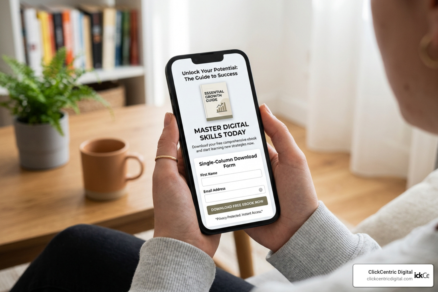
When designing for mobile, adopt a mobile-first approach. Ensure your page uses a clean, single-column layout, large tap-friendly buttons, and highly readable fonts. Avoid large blocks of text that require endless scrolling. For a complete look at responsive layouts, refer to the Interaction Design Foundation’s mobile-first design principles.
Free vs. Paid Ebook Landing Page Strategies
Your design and copywriting strategy will shift depending on whether you are giving your ebook away for free or selling it as a premium product.
| Feature | Free Ebook Strategy | Paid Ebook Strategy |
|---|---|---|
| Primary Goal | High-volume lead generation | Direct revenue and customer acquisition |
| Form Length | Minimal (1-2 fields: Email only) | Checkout form (Billing and payment details) |
| Page Length | Short, punchy, above-the-fold | Long-form sales page with deep details |
| Friction Level | Very low | Moderate to high |
| Social Proof Needed | Moderate (1-2 quick testimonials) | High (Multiple deep-dive reviews, video proof) |
If you are looking to build a highly customized, high-converting checkout experience for a paid ebook, partnering with a local expert can make all the difference. For businesses in West Michigan, collaborating on Custom Web Design in Grand Rapids can help you build seamless payment integrations that protect your conversion rates.
Enhancing Engagement with Video Content
Adding a short video to your landing page can capture the interest of visitors who prefer watching over reading. A 60-second video sales letter (VSL) or a quick “sneak peek” video showing you flipping through the pages of your ebook can build massive excitement.
To see a step-by-step demonstration of how to construct a complete video-driven ebook funnel, watch this video tutorial on building an ebook funnel.
Testing, Delivery, and Avoiding Common Design Mistakes
Building your landing page is only the first step. To achieve elite conversion rates, you must continuously test your design and ensure a flawless post-download user experience.
Common Design Mistakes That Hurt Conversions
Even seasoned marketers make simple design mistakes that quietly kill their conversion rates. Watch out for these three common pitfalls:
- Competing Navigation Links: If you have links to your “About” page, services, or social media profiles in the header or footer, visitors will click away and forget to download your book. Keep the page completely self-contained.
- Slow Page Load Times: A 1-second delay in page load times can cut your conversion rates by 7%. Keep your images compressed and your code clean.
- Cluttered Layouts: Avoid massive walls of text. Use plenty of whitespace, clear headers, and bullet points to give your design breathing room.
For a curated gallery of beautiful, high-converting landing pages that avoid these mistakes, explore Lapa Ninja’s curated landing page design gallery.
A/B Testing Your Landing Page for Continuous Improvement
Never rely on gut instinct alone. A/B testing allows you to show two different versions of your landing page to different visitors to see which one performs better.
Start by testing high-impact elements first:
- The Headline: Test a benefit-focused headline against a problem-focused headline.
- The CTA Button: Test different colors (e.g., green vs. orange) and copy variations.
- Form Fields: Test whether removing the “Phone Number” field increases sign-ups.
To learn how to run statistically significant tests, consult Optimizely’s guide to landing page A/B testing.
Post-Download Delivery Methods and Thank-You Pages
What happens immediately after a user clicks “Download”? The user journey doesn’t end at the form submission.
We highly recommend redirecting users to a dedicated “Thank-You” page. This page serves three crucial functions:
- Confirmation: It reassures the user that their download is on its way.
- Double Delivery: Provide a direct download link on the thank-you page as a backup, while simultaneously sending the PDF to their email inbox.
- The Next Step: Use this high-attention page to invite them to take the next step in your sales funnel—such as scheduling a free consultation or reading a related blog post.
Frequently Asked Questions About Ebook Landing Page Design
What is the ideal form length for an ebook landing page?
For a free lead magnet, the ideal form length is 1 to 3 fields. Typically, asking for just an “Email Address” and “First Name” yields the highest conversion rates. Only add more fields if you are running a highly targeted B2B campaign and need to qualify leads before they reach your sales team.
Should I deliver my ebook on the thank-you page or via email?
You should do both! Redirecting the user to a thank-you page with an immediate download link offers a great user experience. However, you must also send a automated delivery email. This ensures they have a permanent copy in their inbox and trains them to open and engage with your brand’s emails.
How do I drive traffic to my new ebook landing page?
The most effective traffic channels include:
- Organic Search (SEO): Optimize your landing page for specific, high-intent keywords.
- Email Marketing: Promote the new ebook to your existing newsletter subscribers.
- Paid Advertising: Run targeted Google or Facebook ads to reach local audiences actively searching for solutions.
- Social Media: Share valuable excerpts on LinkedIn, Facebook, or Instagram with a direct link to download the full guide.
Conclusion
Your ebook is packed with valuable insights, but without a focused, high-converting landing page, those insights will never reach your target audience. By implementing clean visual hierarchy, benefit-driven copy, minimal forms, and robust social proof, you can easily turn casual visitors into qualified leads.
At ClickCentric Digital, we specialize in helping businesses across West Michigan—including Grand Rapids, Holland, Grand Haven, and Kalamazoo—improve their local search rankings, manage online reviews, and leverage paid traffic.
If you are ready to turn your digital assets into a consistent source of new customers, explore our professional website design and development services today. Let’s work together to build a landing page that truly performs.
Sorry, the comment form is closed at this time.