
04 Jun Inclusive Web Design: Best Practices for a Website Everyone Can Use
Inclusive Web Design: Best Practices for a Website Everyone Can Use
The Website You Built May Be Turning People Away Without You Knowing It
Inclusive web design is the practice of building websites that work for as many people as possible — regardless of disability, age, device, language, or technical ability.
Here’s a quick summary of what that means in practice:
- Who it’s for: People with visual, motor, cognitive, or hearing disabilities — plus older users, non-native speakers, mobile-only users, and anyone in a challenging situation (bad lighting, slow internet, one free hand)
- What it involves: Accessible structure, readable text, keyboard navigation, screen reader support, captions, alt text, and flexible design
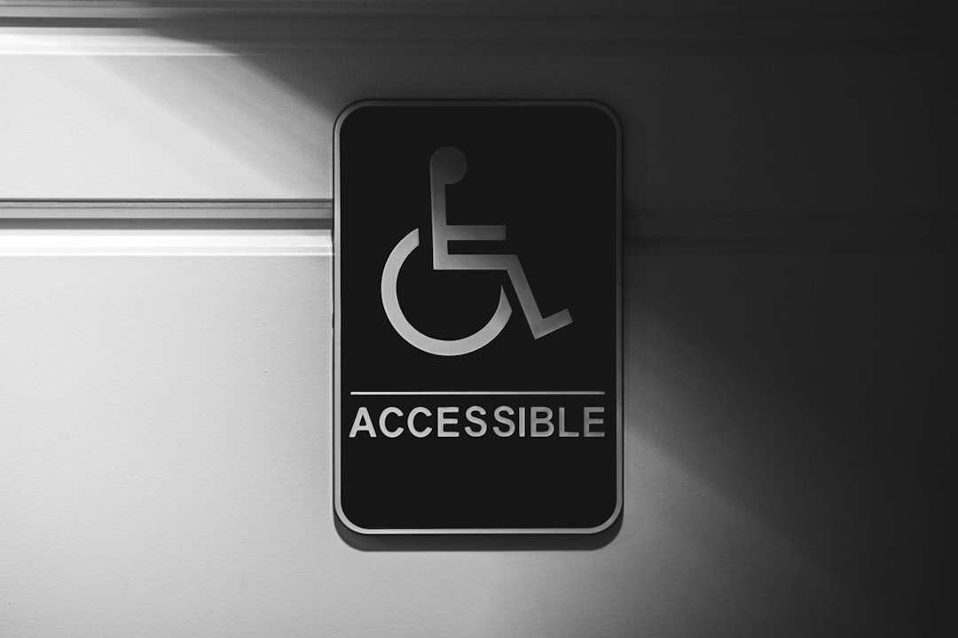
- Why it matters: Over 1 billion people use assistive technology worldwide. More than 97% of top websites still have accessibility failures
- The business risk: Inaccessible websites lose an estimated $2.5 billion every single month in excluded users who simply leave
- The legal risk: ADA Title III lawsuits jumped to 2,352 in 2021 alone — a 14.3% increase from the prior year
Most business owners don’t set out to exclude anyone. But exclusion often happens by default when websites are built around an imaginary “average user” who doesn’t really exist.
Think about it this way: 1 in 6 people worldwide live with some form of disability. That’s a significant chunk of your potential customers — local shoppers, first-time visitors, people searching on their phones — who may hit a wall the moment they land on your site.
And the vast majority of them won’t tell you. They’ll just leave.
The good news is that fixing this doesn’t require starting from scratch. Inclusive design is as much a mindset as it is a checklist. And the changes that make a website more usable for someone with low vision or a motor impairment almost always make it better for everyone.
This guide covers what inclusive web design actually means, the principles and standards behind it, practical strategies to implement it, and the real business impact of getting it right — or ignoring it.

What inclusive web design means in 2026
In 2026, inclusive web design means designing digital experiences around real human diversity, not a narrow default user.
That includes people with:
- Visual disabilities, including blindness, low vision, and color blindness
- Motor disabilities that make mouse use difficult or impossible
- Hearing disabilities that make captions and transcripts essential
- Cognitive and neurological differences that affect memory, focus, reading, or processing
- Speech disabilities that may affect voice-based tools
- Temporary limitations, like a broken arm
- Situational limits, like bright sunlight, a noisy cafe, or slow mobile service
The W3C Introduction to Web Accessibility explains that accessible websites let people perceive, understand, navigate, interact with, and contribute to the web. Inclusive design builds on that idea by asking a broader question:
“Who might be excluded by this decision?”
Then we fix the mismatch.
That might mean using readable type, writing clear copy, supporting screen readers, making buttons keyboard-friendly, compressing images for slower connections, or making forms easier to complete on a phone while someone is standing in a grocery store parking lot in Holland or Grand Rapids.
In other words, inclusive design is not only about compliance. It is about usability, equity, and common sense.
How inclusive web design differs from traditional web design
Traditional web design often starts with business goals, brand style, and a typical user journey. Inclusive web design still cares about those things, but it adds a deeper layer: access.
| Traditional web design | Inclusive web design |
|---|---|
| Designs for an “average” user | Designs for a range of real users |
| Treats accessibility as a later fix | Builds accessibility into planning |
| Assumes mouse, sight, sound, and fast internet | Supports keyboard, screen readers, captions, zoom, and low bandwidth |
| Focuses heavily on visuals | Balances visuals with structure, text, and usability |
| May use color alone to communicate meaning | Uses color plus text, icons, labels, or patterns |
| Optimizes for one main path | Offers multiple ways to complete a task |
| Tests mainly with internal teams | Tests with diverse users and assistive technology |
The difference is subtle but powerful. Traditional design asks, “Does this look good and work for most people?” Inclusive design asks, “Who could this exclude, and how can we remove that barrier?”
That shift changes everything.
Inclusive web design for permanent, temporary, and situational needs
One of the most useful ideas in inclusive design is that limitations can be permanent, temporary, or situational.
For example:
- A person who is deaf needs captions permanently.
- A person with an ear infection may need captions temporarily.
- A person watching a video in a noisy coffee shop may need captions situationally.
Same solution. Different users. Wider benefit.
Other examples:
- Keyboard navigation helps people with motor disabilities, people with a broken mouse, and power users who prefer shortcuts.
- High color contrast helps users with low vision and anyone reading outside in bright sunlight.
- Voice input helps users with limited mobility and someone cooking with messy hands.
- Simple navigation helps users with cognitive impairments and first-time visitors who are just trying to find your hours.
This is often called the curb-cut effect: a feature designed for one access need ends up helping many more people.
Who benefits from inclusive web design?
The short answer: everyone.
The longer answer includes:
- People with disabilities, including the 1 in 6 people worldwide who live with some form of disability
- More than one billion people who rely on assistive technology, a number expected to grow significantly by 2050
- People with visual disabilities, estimated at 253 million worldwide
- Users with cognitive impairments, who may need simpler layouts and clearer instructions
- Screen reader users, including those who reported in WebAIM research that web accessibility still has a long way to go
- Older adults who may need larger text, simpler navigation, and clearer forms
- Mobile users searching for a local business in West Michigan
- Non-native English speakers
- First-time visitors who do not know your brand yet
- Distracted users trying to book, buy, call, or get directions quickly
For local businesses, this matters because many website visits are task-driven. Someone wants a phone number, appointment form, menu, service page, store hours, quote request, or directions. If your site makes that harder, you lose the lead.
Principles and standards that define an inclusive website
Inclusive websites are guided by both formal standards and practical design principles.
The primary technical standard is WCAG (Web Content Accessibility Guidelines), developed by the W3C and organized around four principles: perceivable, operable, understandable, and robust. WCAG 2.2 is also recognized as an ISO standard.
For Michigan businesses, the Americans with Disabilities Act (ADA) provides the legal framework for website accessibility. Section 508 applies to federal agencies and organizations working with them. If you sell globally, other regional requirements may apply.
However, standards are the floor, not the ceiling. A website can pass automated checks and still feel confusing. The goal is to help real people use your site. For a strong foundation, start with the WCAG accessibility fundamentals.
The four WCAG POUR principles
WCAG is built around POUR:
- Perceivable: Users must be able to perceive the information. This requires text alternatives for images, captions for videos, readable contrast, and layouts that work when zoomed.
- Operable: Users must be able to operate the interface. This means keyboard access, visible focus states, sufficient time to complete tasks, and no keyboard traps.
- Understandable: Users must be able to understand the content and interface. This includes clear language, predictable navigation, and helpful form error messages.
- Robust: The website must work with current and future technologies, requiring clean semantic HTML, proper labels, and compatibility with assistive tools.
If someone cannot see the screen, use a mouse, hear the audio, or load a heavy page quickly, can they still complete their task? If not, there is work to do.
WCAG conformance levels: A, AA, and AAA
WCAG has three conformance levels:
- Level A: Basic accessibility requirements. Missing these creates serious barriers.
- Level AA: The widely accepted target for most business websites. This includes color contrast, keyboard accessibility, labels, and error identification.
- Level AAA: The highest level. It offers enhanced accessibility but is not always realistic for every page.
For most businesses, WCAG 2.2 AA is the best baseline. It is practical, recognized, and addresses most common barriers. Accessibility is not a one-time stamp; ongoing checks are essential as content is updated.
Inclusive design principles beyond compliance
Compliance tells us what to avoid; inclusive design tells us how to think.
Microsoft’s inclusive design approach is highly effective: recognize exclusion, learn from diversity, and solve for one while extending to many. Explore their framework here: Microsoft inclusive design principles.
Key principles include:
- Flexibility: Let people interact in different ways.
- Simplicity: Keep tasks clear and direct.
- Consistency: Maintain predictable navigation and layouts.
- Equity: Provide comparable experiences, not second-class alternatives.
- Choice and control: Let users pause motion, zoom text, and adjust settings.
Good inclusive design feels calm and intuitive, ensuring users never have to fight the interface.
Best practices for making a website everyone can use

The best inclusive websites are built through smart structure, thoughtful content, and testing, rather than tossing an accessibility widget on top at the end. The Design and accessibility UX guidance from web.dev is an excellent resource for understanding how design choices affect accessibility.
Build accessible structure and navigation
Start with the skeleton of the page:
- Use one clear H1 per page and logical H2/H3 headings.
- Use semantic HTML (
header,nav,main,section,footer). - Provide descriptive page titles and consistent menus.
- Include skip links so keyboard users can jump directly to the main content.
- Write descriptive links like “View our web design services” instead of “click here.”
Keyboard access is essential. Every interactive element must be usable with the Tab, Enter, Space, and arrow keys. Focus states should be highly visible. Avoid keyboard traps, where a user can tab into a menu or modal but cannot escape.
Make text, color, and visuals readable
Readability is one of the fastest ways to improve inclusion:
- Use at least 4.5:1 contrast for normal text and 3:1 for large text.
- Never use color alone to convey meaning (e.g., pair red error text with an icon).
- Use relative units like
remso text scales cleanly when zoomed up to 200%. - Keep line lengths comfortable (60 to 70 characters) with generous spacing.
- Avoid embedding important text inside images.
The MDN guide on Designing for all user types offers practical guidance on contrast, font sizing, and alternative content.
Support screen readers and assistive technologies
Screen readers rely on clean code and structure:
- Add descriptive alt text for meaningful images, and empty alt attributes (
alt="") for decorative ones. - Use real buttons for actions and real links for navigation.
- Label form fields properly and keep heading order logical.
- Use ARIA attributes only when native HTML cannot do the job.
Native HTML should always be your first choice. Overusing ARIA often introduces more problems than it solves.
Create inclusive forms and conversion paths
Forms are where accessibility issues directly impact revenue. A broken form is a lead shredder.
Inclusive form practices include:
- Use visible, permanent labels instead of placeholder-only text.
- Clearly mark required fields and provide helpful instructions.
- Use readable inline errors and autocomplete attributes for common fields.
- Ensure touch targets are large enough for mobile users.
- Allow complete keyboard-only form submission.
If your forms or checkout paths are frustrating users, it may be time to seek professional development help. We cover common signs here: Website development warning signs.
Design inclusive content and media
Inclusive content is clear, scannable, and available in multiple formats:
- Use plain language, short paragraphs, and bulleted lists.
- Provide captions for videos and transcripts for audio.
- Include pause controls for any moving or auto-playing content.
- Avoid flashing content that could trigger seizures.
- Use diverse, non-stereotypical imagery.
If your homepage video explains your entire offer but lacks captions, many users will miss your message entirely.
Make mobile, performance, and responsive design inclusive
Mobile accessibility is non-negotiable for local businesses. Inclusive mobile design includes:
- Responsive layouts with large touch targets.
- No forced horizontal scrolling.
- Support for both portrait and landscape orientations.
- Compressed images and fast load times.
Performance is a key part of inclusion. A beautiful website that loads slowly on a mobile connection is not inclusive. A growth-driven approach helps you improve accessibility in manageable stages. Learn more here: Growth-driven design process.
How to measure and improve website accessibility

You cannot improve what you do not measure. A comprehensive accessibility audit should include automated scans, manual expert reviews, keyboard and screen reader testing, and mobile usability checks.
While automated tools are helpful for catching common WCAG failures, they cannot judge whether alt text is meaningful or if instructions are easy to understand. Manual testing remains essential.
What to test first
Start where the business impact is highest:
- Homepage and main navigation
- Contact pages and lead forms
- Product, service, and checkout pages
- Booking or appointment tools
- Reusable components (like buttons and menus)
- Location pages for Grand Rapids, Holland, Grand Haven, South Haven, Kalamazoo, and West Michigan searches
Useful accessibility testing methods
Use a balanced mix of testing methods:
- Automated scans: Quickly catch basic WCAG failures.
- Keyboard-only testing: Unplug your mouse and try to complete core tasks.
- Screen reader review: Test with common screen readers and browser combinations.
- Browser zoom testing: Verify layouts remain functional at 200% zoom.
- Mobile device testing: Test on real mobile devices, not just desktop simulators.
- Cognitive walkthroughs: Ensure content and steps are simple and intuitive.
Accessibility metrics businesses should track
Track metrics that connect accessibility to user experience and business outcomes:
- Number and severity of WCAG issues
- Keyboard completion and form error rates
- Form abandonment and conversion rates
- Bounce rates and page speed
- Support requests related to website usability
For paid traffic, landing page accessibility is critical. If ads send users to pages with poor contrast or broken forms, your budget is wasted.
How to maintain accessibility over time
Accessibility requires ongoing ownership. Build it into your workflow with:
- A clear “definition of done” that includes accessibility checks.
- Content author training and editorial guidelines.
- Accessible design systems and component libraries.
- Regular audits and retesting after plugin or platform updates.
Professional website support makes this process seamless. Our Website Design & Development services are built to create websites that are easier to use, find, and improve over time.
Business benefits and risks of inclusive web design
Inclusive design is the right thing to do, but it is also smart business. When a website is easier to use, more people can become customers. This is a major competitive advantage for local businesses in Grand Rapids, Holland, Grand Haven, South Haven, Kalamazoo, and across West Michigan.
Benefits for users and customers
For users, inclusive design creates:
- Equal access to information and greater independence.
- Reduced frustration and faster task completion.
- Clearer purchase and contact paths.
- Better mobile experiences and stronger brand trust.
People remember whether a website made them feel capable or frustrated. That emotional connection directly impacts customer loyalty.
Benefits for SEO, paid traffic, and conversions
Many accessibility best practices directly overlap with SEO and conversion optimization:
- Semantic HTML helps search engines crawl and understand your content.
- Descriptive alt text improves image search context.
- Clear headings and fast page speeds enhance user experience and rankings.
- Mobile-friendly layouts support local search behavior.
- Optimized forms and clear CTAs reduce abandonment and boost conversions.
For ecommerce sites, accessibility directly impacts browsing, cart usage, and checkout. We explore development choices that affect online stores here: BigCommerce development insights.
Risks of ignoring accessibility
Ignoring accessibility can lead to severe consequences:
- Lost leads, sales, and abandoned carts.
- Negative reviews and lower brand trust.
- Poor mobile engagement and search performance loss.
- Costly redesign debt and legal exposure.
The legal risk is real. ADA Title III lawsuits have risen significantly, with websites increasingly treated as places of public accommodation.
But the most immediate risk is simple: when users encounter a barrier, they do not complain. They just leave and choose a competitor.
Frequently Asked Questions about inclusive web design
What is the difference between accessibility and inclusive design?
Accessibility focuses on removing barriers for people with disabilities, often using standards such as WCAG. It covers things like screen reader support, keyboard navigation, captions, contrast, form labels, and semantic code.
Inclusive design is broader. It is a methodology for designing around human diversity. It includes disability access, but also considers age, language, culture, device type, digital literacy, temporary injuries, situational barriers, and technical constraints like slow internet.
The simplest way to put it:
- Accessibility asks, “Can people with disabilities use this?”
- Inclusive design asks, “Who else might be excluded, and how can we design better for them too?”
You need both.
Can a website become inclusive without a full redesign?
Yes. Many accessibility improvements can be made incrementally.
Good starting points include:
- Add missing alt text.
- Improve color contrast.
- Fix heading order.
- Add form labels.
- Make buttons keyboard accessible.
- Improve focus states.
- Caption videos.
- Rewrite confusing content.
- Repair templates used across the site.
- Simplify navigation.
- Improve mobile layouts.
- Compress oversized images.
An audit-first approach is usually best. Find the highest-impact issues, prioritize them, fix them, and retest. Sometimes a full redesign is necessary, especially if the site is outdated or structurally broken, but many businesses can make meaningful progress before that point.
Does inclusive web design make websites less attractive?
No. Inclusive web design usually makes websites better looking because it forces stronger hierarchy, better spacing, clearer typography, and more intentional design choices.
Accessible does not mean plain. It means usable.
In fact, constraints often improve creativity. When designers cannot rely on tiny gray text, vague icons, color-only cues, or confusing animation, they have to create cleaner, smarter interfaces.
A beautiful website that people cannot use is not good design. It is decoration with hosting fees.
Conclusion
Inclusive web design is about building websites that welcome more people in instead of quietly pushing them away.
It combines accessibility standards, human-centered thinking, strong UX, clear content, responsive design, and ongoing improvement. WCAG 2.2 AA is a smart baseline, but true inclusion goes further than compliance. It asks us to recognize exclusion, learn from real users, and create flexible experiences that work in the messy reality of everyday life.
For businesses, the upside is clear: better usability, stronger SEO, improved conversion paths, lower legal risk, and more trust with the people you want to reach.
At ClickCentric Digital, we help businesses turn websites into stronger customer acquisition tools through search, paid traffic, reviews, and user-focused web strategy. If your site is hard to use, slow to load, or quietly losing leads, inclusive design is one of the smartest places to start.
Ready to build a website more people can actually use? Improve your website design and development.
Sorry, the comment form is closed at this time.